rejuvanate the user experience - nose
In this case study, I will take you through the process of both building and improving a local business’s online presence, providing e-commerce that matches user’s needs.
Project Deliverable:
Website, Interaction Design, UI Illustration
Timeline:
Mar 2023 (1 month)
Tools:
Miro,Figma, Google Docs
Design process
ℹ️ about nose:
Nose is a local pet shop in Surry Hills Sydney and have serviced the pet owner community in the area for many years. The pet shop provides a wide range of high quality pet products that cannot be easily found in other major retails and it also provides professional grooming services.
🤔 The problem:
To make the site a smoother experience, less cluttered and confusing, prioritising what information needs to be shown and reducing the effort needed to get to the final booking page.
To provide an engaging and interactive user experience so that the user doesn't leave the website in a hurry.
🎯 The goal:
The usability of NOSE e-commerce website isn’t smooth and intuitive, users tend to get frustrated and leave the website.
They were losing potential customers due to the confusing flow and the high number of clicks that were needed to get to the final payment stage.
comparative analysis
Keep it simple: As evidenced by Amazon's checkout flow, simplicity is key to a user-friendly checkout process. The flow should be easy to understand and navigate, with clear calls to action and minimal distractions.
Clear guidance: Need to make sure steps are clearly labeled and the user knows what is expected of them at each stage of the process.
Minimise friction: When the user is required to input a lot of information or navigate through multiple pages, there will be friction.
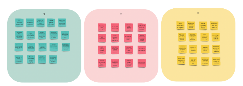
user interview & affinity mapping
user PERSONA
“It can be overwhelming trying to navigate all the products online.”
“I 'm willing to pay a premium price for products that meet my standards (high-quality, natural and visually appealing). ”
Problem Statement:
The local pet shop's e-commerce website is providing a frustrating and confusing shopping experience for its customers, resulting in low conversions and customer loyalty.
The website lacks intuitive navigation, clear product information, and a streamlined checkout process, and fails to effectively convey the pet shop's unique value proposition and brand identity.
The pet shop needs to create a more effective and engaging e-commerce experience that meets customer needs.
site map
Sketches
user flow
Wireframe
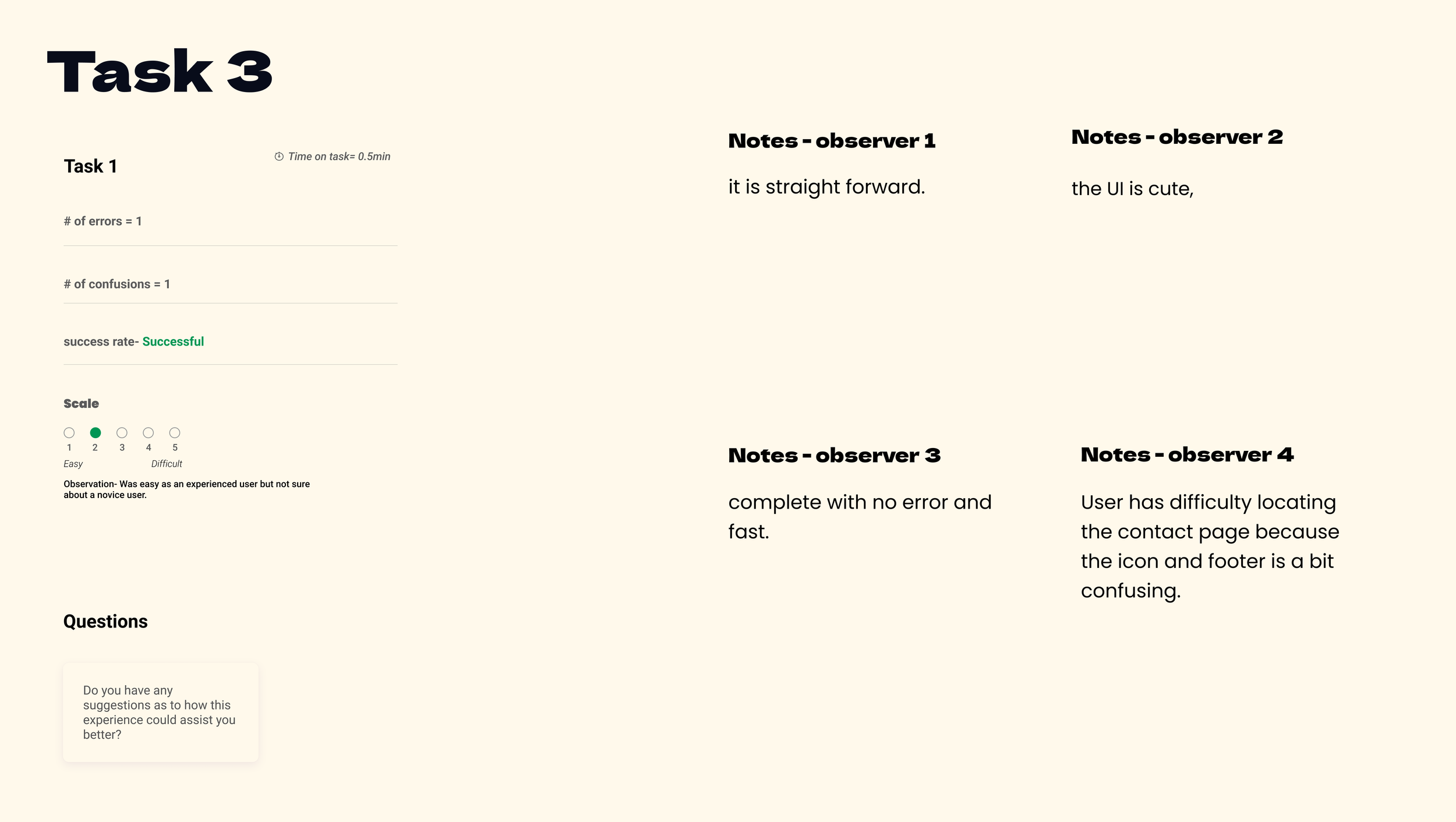
usability testing
iterated prototype
Product discovery flow
About & sign up flow
check out flow
Reflection
Reflection
Stay hungry, stay foolish.
Next Steps:
in-depth user research
UI design


